For light backgrounds
Transparent PNG

The same conversation mark. With the name, or on its own.
SuperDebate / Brand resources
One unmistakable identity, from a neighborhood debate night to the national stage. The logos, colors, and principles that make it SuperDebate.

A conversation. A shared standard.
01 / Identity
Two conversation bubbles form a shield, with an SD monogram at the center. This is our signature. Choose the version for your background, then download the full logo or the individual icon. Every PNG has a transparent background.
Both backgrounds · 10 PNGs · usage guide
The same conversation mark. With the name, or on its own.


The same conversation mark. With the name, or on its own.
Leave at least a quarter of the shield’s height clear on every side. Keep text and other logos outside that space.
Use the icon at 32px tall or larger, and the full logo at 200px wide or larger. For small placements, choose the icon.
Preserve the proportions and gold detail. On photos, use a solid light or dark panel so every part of the shield stays visible.
Use 1024px or 2048px for full logos on high-density screens. Original icon downloads preserve the source file exactly. Confirm resolution with your printer.
02 — Palette
Monochrome with one accent — gold. Restraint signals taste; a single accent signals confidence. The semantic hues (success / warning / destructive / info) exist only to communicate state. If a UI surface wants colour for decoration, the answer is gold or nothing.
03 — Type
Two faces, three jobs. Display (Bebas Neue) carries the marquee. Body (Google Sans Flex) carries the argument — and, set in uppercase with wide tracking, it also carries the margin notes: dates, statuses, captions. No third typeface. Together they read like a printed annual report, not a SaaS dashboard.
Display
AaBbCc
Titles only. Limit to headlines — never long text.
Body
We’re trying to look like The Economist ran a debate tournament inside a members-only club.
Paragraphs, UI, buttons. Regular weight — emphasize with size or gold accent.
Labels
04.17.2026 · Chicago, IL
The editorial spice — eyebrows, timestamps, tracking-wide caps. Same body face, uppercase + wide tracking. No third typeface, ever.
04 — Voice
Serious, a little old-world, confident without shouting. Never sterile, never gamified, never SaaSy.
“Editorial newspaper meets premium club.”
Serious
Ideas matter. So does the room they’re argued in.
Welcoming
A first-time debater should feel like they’ve walked into a room where people take ideas seriously.
Confident
We don’t need to shout. Calm, deliberate language carries the weight.
05 — Surfaces
Four card archetypes — never a fifth. Standard for catalog content. Glass when something genuinely floats over another layer. Cream for warmer highlight blocks. Dark for the premium / championship moments. Picking the wrong archetype is how a page starts feeling SaaSy.
Standard card
Border + soft shadow.
Standard
styles.card
List pages, forms, flat content.
Glass card
Translucent + blurred.
Glass
styles.cardGlass
Floating panels, feeds, overlays.
Cream card
Tinted, no border, soft.
Cream
styles.cardCream
Warmer blocks on light sections.
Dark card
Border + hover-gold.
Dark
styles.darkCard
On bg-ink sections.
06 — Components
Buttons and pills come pre-built with light / dark variants. Use them as-is — overriding a light variant with className text-white loses the CVA fight every time.
Light surfaces
Dark surfaces
Don’t
Colored text on a tinted background of the same hue (e.g. bg-purple-100 text-purple-700) fails contrast and reads as off-brand. Reach for styles.pillGlass / styles.pillGlassLight instead — they were built for this.
07 — Motion
Purposeful, quick, never bouncy. If motion isn’t communicating something, remove it.
Stagger entrance
animations.stagger.container + .item
Card 1
+0ms
Card 2
+60ms
Card 3
+120ms
Card 4
+180ms
Hover lift
styles.cardHover
08 — Inclusive
Editorial design that works for everyone — keyboard users, screen readers, low vision, reduced motion.
Touch targets ≥ 44×44px
Every interactive element meets the WCAG mobile target rule. The base button height is 44px on touch viewports, 40px on desktop.
Keyboard-first focus rings
Focus rings are gold (focus-visible:ring-gold) on a 2px offset. Visible on every focusable element — never `outline-none` without a visible alternative.
Reduced motion respected
prefers-reduced-motion disables all stagger entrances, hover lifts, and parallax. Content renders instantly without flashing through opacity:0.
Contrast at AA or better
muted-foreground sits at 4.5:1 on paper/cream backgrounds. Gold on ink, paper on ink, ink on paper, and ink on gold all clear AA for body text.
Icons paired with text
Lucide icons accompany text on every interactive element. Icon-only buttons get an aria-label. No icon ever stands alone as the only affordance.
09 — Rhythm
Breath matters. Newspaper layouts give content room.
Read-dense content (blog, about)
Default content width
List pages, grids
Wide editorial pages
10 — Icons
Lucide only. 14–20px. Always paired with text on interactive elements.
Sparkles is banned
lucide-react/Sparkles
Reads as generic AI shimmer. Use a more specific icon (Trophy, Award, Crown) or none at all.
11 — Build with it
Three compounds you’ll build most. Each part lists the token AND the reasoning, so a designer or another agent can re-assemble without guessing why a choice was made.
SuperDebate / Visual Canon
Editorial newspaper meets premium club. Monochrome with a gold accent.
Hero block
Dark surface · 4 parts
Mono eyebrow
styles.labelMD · text-gold
Mono signals metadata — the small line above the headline that sets context before the big type lands. Gold marks emphasis.
Display headline
styles.heading1Dark
Bebas Neue at hero scale. Uppercase, tight tracking, leading-none — the marquee that carries the page.
Lead paragraph
styles.heroLead
One paragraph in body type, 42ch max, slightly muted (paper/85) so the headline above stays loudest.
Button row
variant="solid-on-dark" · variant="ghost-on-dark"
Two CTAs, never three. The built-in dark variants beat trying to override outline/ghost — CVA wins those fights.
<section className="dark bg-ink">
  <div className={styles.contentContainer}>
    <p className={cn(styles.labelMD, 'text-gold')}>
      EYEBROW
    </p>
    <h1 className={styles.heading1Dark}>
      Headline
    </h1>
    <p className={styles.heroLead}>
      Lead paragraph.
    </p>
    <Button variant="solid-on-dark">Primary</Button>
    <Button variant="ghost-on-dark">Secondary</Button>
  </div>
</section>
May 30 · 7:00 PM
Two championship debaters formally debate the GOAT question. Online — recorded live.
Online · SuperDebate platform
Content card
Light surface · 4 parts
Mono eyebrow
font-mono text-xs · text-gold-dark · uppercase
Date or status in mono caps. Tells you what the card is about before you read the title.
Display title
styles.heading4
Bebas Neue at card scale. Always one line — clamp it if it grows. Sharp corners, sharp type.
Body copy
styles.bodyMD · text-muted-foreground
Two lines max via line-clamp-2. Muted so the title leads the eye, body fills in.
Meta line
font-mono text-xs · text-muted-foreground
The footer of the card — location, channel, host. Mono returns the rhythm started at the top.
<div className={cn(styles.cardPadded)}>
  <p className="font-mono text-xs uppercase text-gold-dark">
    EYEBROW
  </p>
  <h3 className={styles.heading4}>Card title</h3>
  <p className={cn(styles.bodyMD, 'text-muted-foreground')}>
    Body copy goes here, two or three short sentences.
  </p>
  <p className="font-mono text-xs uppercase text-muted-foreground">
    META · LOCATION
  </p>
</div>
11 — Build with it
The three compounds you’ll build most — each part labeled with the exact token.
Section opener
Reused 50+ times · 3 parts
Numbered mono eyebrow
font-mono text-[0.7rem] · text-gold-dark
A numbered prefix (01, 02…) gives the page a deliberate spine — like chapter headers in a printed annual report.
Display section title
styles.heading2
One short clause. Display type carries the section without needing decoration around it.
Optional blurb
font-body text-lg · text-muted-foreground
One sentence that names what the section is for. Skip it if the title is self-evident.
<section className={cn(styles.sectionPadYHuge)}>
  <div className={styles.contentContainer}>
    <p className="font-mono text-[0.7rem] uppercase
                  tracking-[0.18em] text-gold-dark">
      01 — SECTION
    </p>
    <h2 className={styles.heading2}>Section title</h2>
    <p className="font-body text-lg text-muted-foreground">
      Optional blurb under the title.
    </p>
  </div>
</section>
12 — Case Studies
The canon assembled. Four real surfaces, each annotated with what it’s trying to communicate and the deliberate moves on display — so the reader can see the brand thinking, not just the brand output.
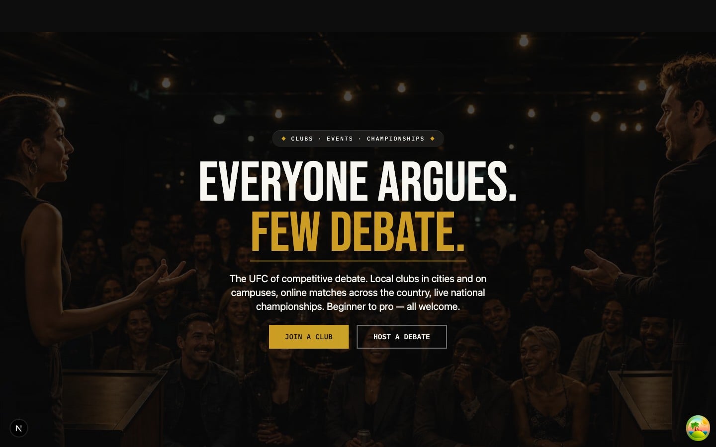
UFC-style marquee meets editorial restraint. The headline lands like a cage walkout, the lead paragraph reads like a newspaper sub-deck.
Deliberate moves
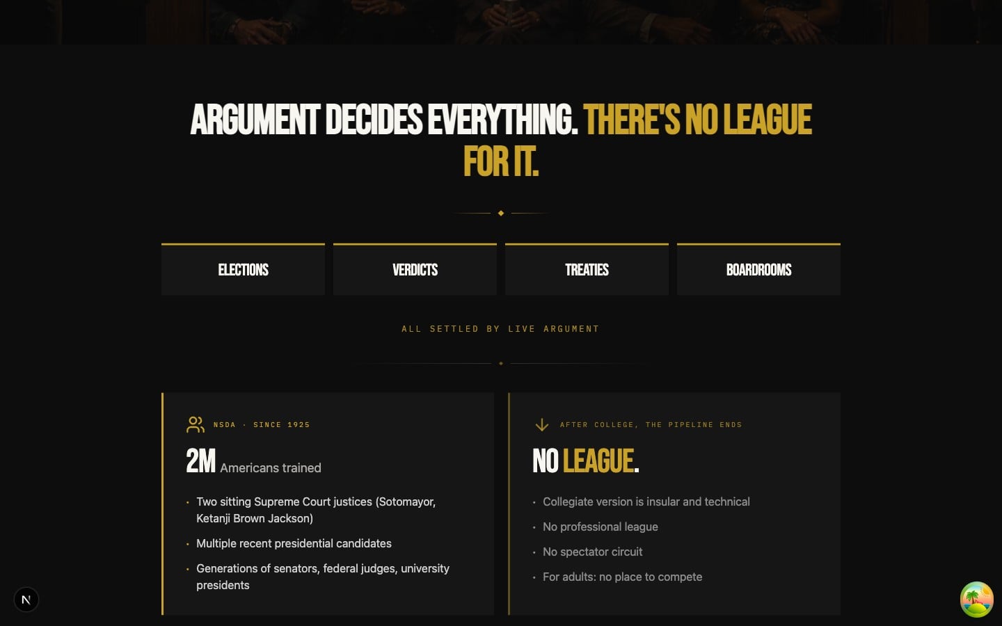
A printed annual report rebuilt as a presentation. Dark surface, hairline structure, every number sits beside its label.
Deliberate moves
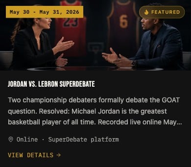
A standard card. Sharp corners, soft shadow, gold date-stamp. The Greek Agora bulletin board, redrawn for screens.
Deliberate moves
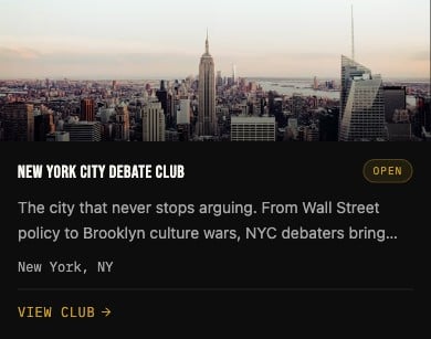
A members-only club roster card. Dark surface and gold-tinted hover make it feel like a leather-bound directory, not a SaaS list item.
Deliberate moves
12 — Guardrails
The patterns we reject in review.
Topic
Accent color
Use gold for emphasis. One accent only.
Reach for purple, blue, teal, slate to vary things up.
Topic
Color tokens
text-foreground, bg-card, border-border — semantic tokens.
text-gray-900, bg-slate-50 — raw Tailwind palette (pre-commit blocks it).
Topic
Dark sections
Add the dark class on every bg-ink wrapper so muted text contrasts.
Set bg-ink alone and watch muted-foreground turn unreadable.
Topic
Glass surfaces
Apply glass when you need real layering (overlay, floating panel).
Add backdrop-blur to an opaque surface for vibes.
Topic
Headlines
Pick uppercase + display OR a gold accent — one move at a time.
Stack sentence-case + gradient text + bold + uppercase together.
Living Doc
This page is the public canon. When it disagrees with the live product, the product wins and this page gets updated.